

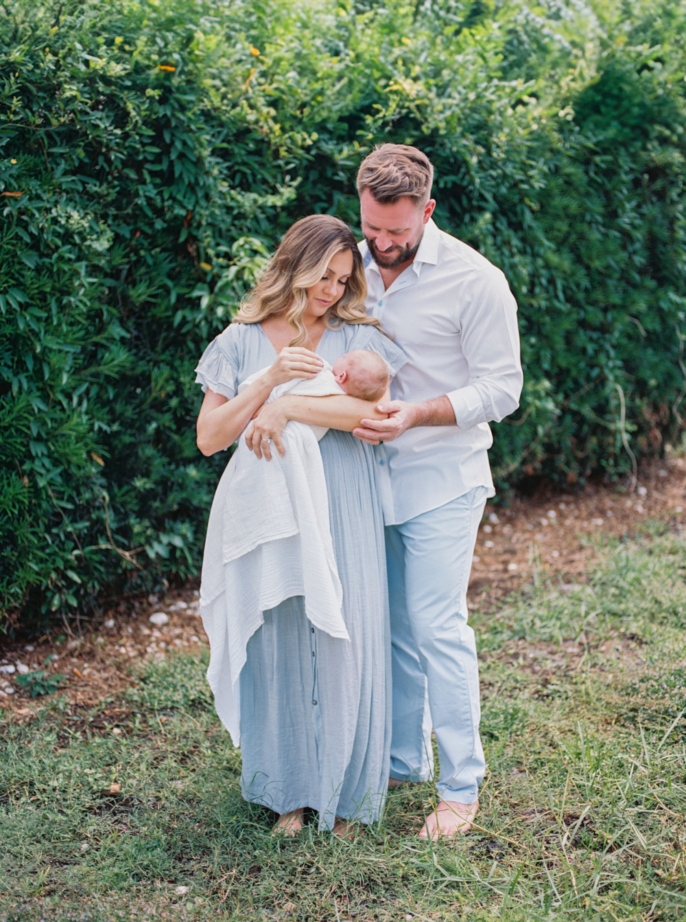
Have you ever looked at an image and noticed it could be amazing, but there is something a little off? You can’t quite figure out what it is? Maybe the light was great, your clients were dressed perfectly, the background looks pretty, but your clients look gray?
The answer could be a simple adjustment to your white balance!
Adjusting white balance in Lightroom
To adjust your white balance in Lightroom, all you need is to locate color sliders in the Basic Panel. You can find these by selecting your image within the Develop Module of Lightroom and clicking on the Basic Panel in the top right side of your screen.
The temperature slider will make the image warmer. Slide to the right to add more yellow or warmth to your image. Slide left to make your image cooler, or add more blue to your image.
The tint slider will add magenta (right) or green (left) to the image.
You can play with these sliders until the balance looks right!
How do you know if you white balance is accurate?
A good tool I use to check to see if my white balance is accurate is putting my cursor on something that should be a true white or neutral in my image. The neutral colors or objects I look for are white, a gray, or a black. Sometimes I can find this patch of color on shirt, ceiling, baseboard, sidewalk, or even the white of an eyeball.
With my cursor on this part of my image, I look underneath the histogram. There will three numbers, one for red, one for green, and and one for blue. If all of those numbers are the same, or pretty close, that usually means that my white balance is good. I eyeball the image to make sure I like how the color looks and adjust as needed, but looking at these numbers really helps me to ensure color accuracy in most situations!
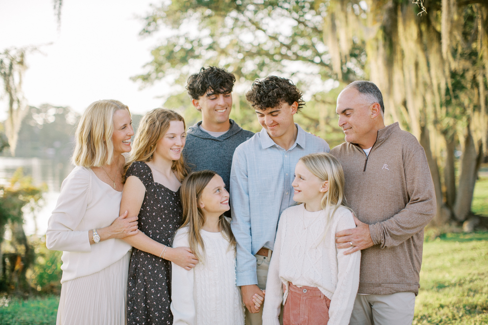
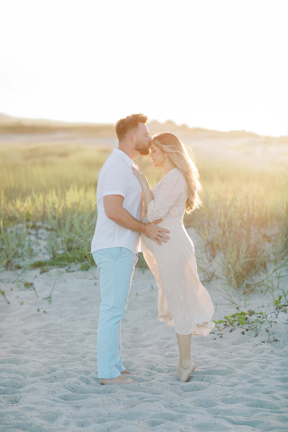
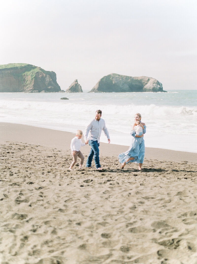
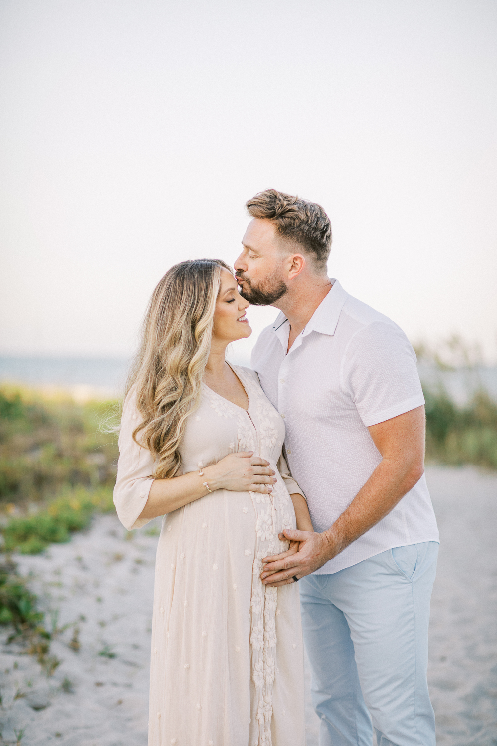
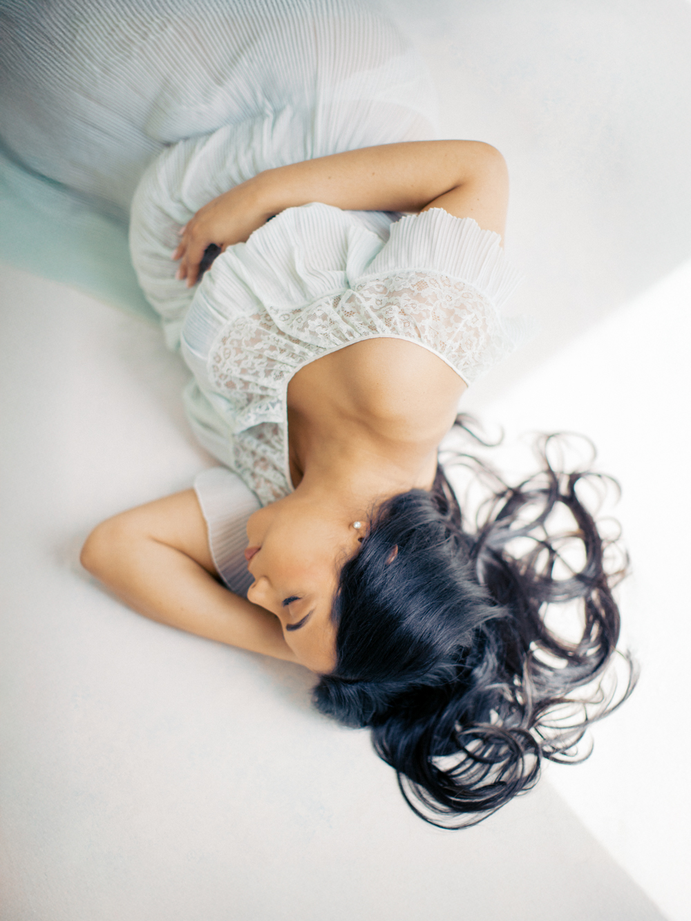
Bright whites and beautiful skin tones
Accurate whites and skin tones will take your images from good to great! Beautiful skin tones in my photographs became commonplace in my work once I understood white balance. The eyedropper check method helps me to ensure my whites are always crisp and bright, keeping away yellow tones. It also ensures my skin tones are accurate so my clients don’t end up with gray skin, caused by too much blue in an image.
If these red, green and blue numbers under the histogram align, my skin tones and everything else color wise usually fall into the place from there!
Check out the video below to see how this works:
Do you want more photography and editing tips? Check out the blog for free education, or sign up for my free guide The Magic of Film on Digital.


+ COMMENTS
add a comment